
一、前言:
使⽤matplotlib画图时,由于matplotlib默认没有中⽂,显⽰中文时会出现空⽩⼩⽅块。
二、方法:
2.1 matplotlib中使用SimHei字体
1)进入终端后查看matplotlib的字体路径:
$ python
>>> import matplotlib
>>> print(matplotlib.matplotlib_fname())
得到路径:/Users/dongjun/.local/lib/python3.7/site-packages/matplotlib/mpl-data/matplotlibrc
2)下载SimHei.ttf字体:
https://us-logger1.oss-cn-beijing.aliyuncs.com/SimHei.ttf
3)将下载好的SimHei.ttf字体移动到第⼀步查询到的字体⽬录./fonts/ttf/下:
cp SimHei.ttf /Users/dongjun/.local/lib/python3.7/site-packages/matplotlib/mpl-data/fonts/ttf/SimHei.ttf
4)清理matplotlib缓冲⽬录:
$ python
>>> import matplotlib
>>> print(matplotlib.get_cachedir())
得到缓冲目录为:/Users/dongjun/.matplotlib
$ rm -f /Users/dongjun/.matplotlib
5)修改matplotlib原始文件
vim /Users/dongjun/.local/lib/python3.7/site-packages/matplotlib/mpl-data/matplotlibrc
依次修改以下内容:
# 去掉前⾯的#
font.family:  sans-serif
# 去掉前⾯的#,⼿动加SimHei
font.sans-serif: SimHei, DejaVu Sans, Bitstream Vera Sans, Computer Modern Sans Serif, Lucida Grande, Verdana, Geneva, Lucid, Arial, Helvetica, Avant Garde, sans-serif
# 去掉前⾯的#,把True改为False
axes.Unicode_minus: False  # use Unicode for the minus symbol rather than hyphen.
6)重启测试
在matplotlib中导入SimHei字体,重新画图即可。
import matplotlib.pyplot as plt
plt.rcParams['font.sans-serif'] = ['SimHei']
plt.rcParams['axes.unicode_minus'] = False
2.2 使用其他字体
import cv2
import numpy as np
import matplotlib.pyplot as plt
%matplotlib inline
plt.rcParams['font.sans-serif']=['Songti SC'] #用来正常显示中文标签
# 或者是下面这个,宋体和仿宋字体,都可以用。
plt.rcParams['font.sans-serif']=['STFangsong'] #用来正常显示中文标签
plt.rcParams['axes.unicode_minus'] = False  # 用来正常显示负号
Windows与Mac通用
import matplotlib.pyplot as plt
plt.rcParams['font.sans-serif']=['SimHei','Songti SC','STFangsong']
plt.rcParams['axes.unicode_minus'] = False  # 用来正常显示负号
示例:
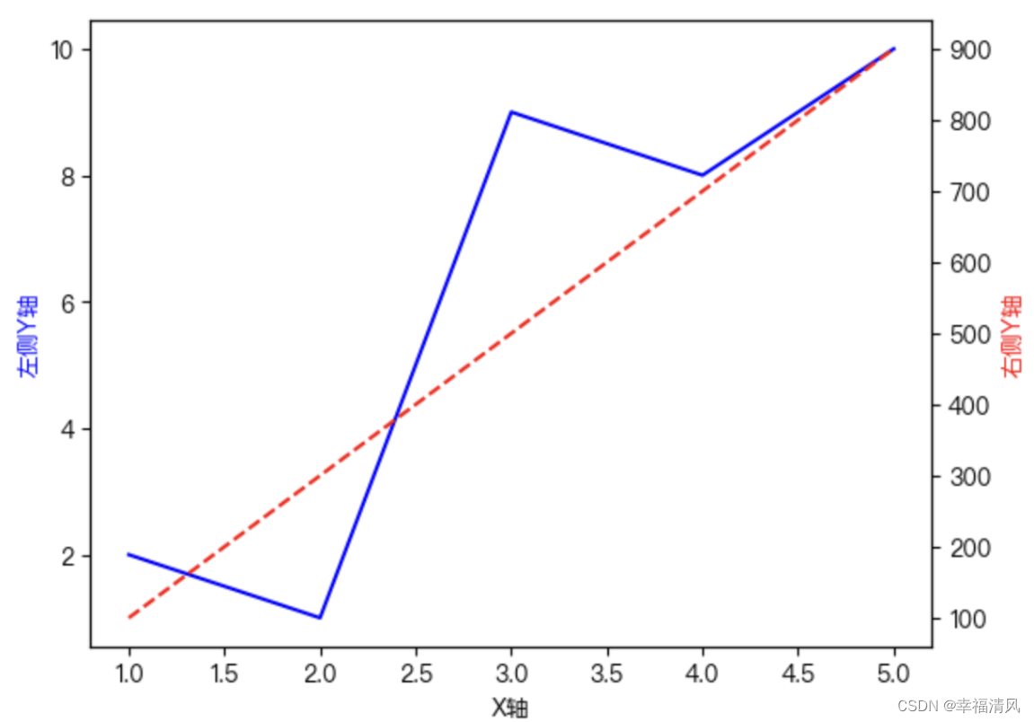
import matplotlib.pyplot as plt
import matplotlib

#from matplotlib import font_manager
#plt.rcParams['font.sans-serif'] = ['Heiti TC']

#plt.rcParams['font.sans-serif'] = ['Songti SC']

#plt.rcParams['font.sans-serif'] = ['Arial Unicode MS']

plt.rcParams['font.sans-serif'] = ['PingFang HK']


# 创建数据
x = [1, 2, 3, 4, 5]
y1 = [2, 1, 9, 8, 10]
y2 = [100, 300, 500, 700, 900]

# 创建图形和轴
fig, ax1 = plt.subplots()

# 绘制左侧Y轴数据
ax1.plot(x, y1, 'b-')
ax1.set_xlabel('X轴')
ax1.set_ylabel('左侧Y轴', color='b')

# 创建第二个Y轴
ax2 = ax1.twinx()

# 绘制右侧Y轴数据
ax2.plot(x, y2, 'r--')
ax2.set_ylabel('右侧Y轴', color='r')

# 显示图形
plt.show()
效果: