
uniapp自带的tabbar组件可以方便地实现底部导航栏的功能,原生tabBar是相对固定的配置方式,但是默认的样式可能无法满足我们的需求,所以我们需要自定义设置tabbar样式。下面我会详细介绍uniapp自定义tabbar样式的方法。
(图片来源网络,侵删)
一、pages.json代码
pages.json这里只配置页面路径就可以。
(图片来源网络,侵删)
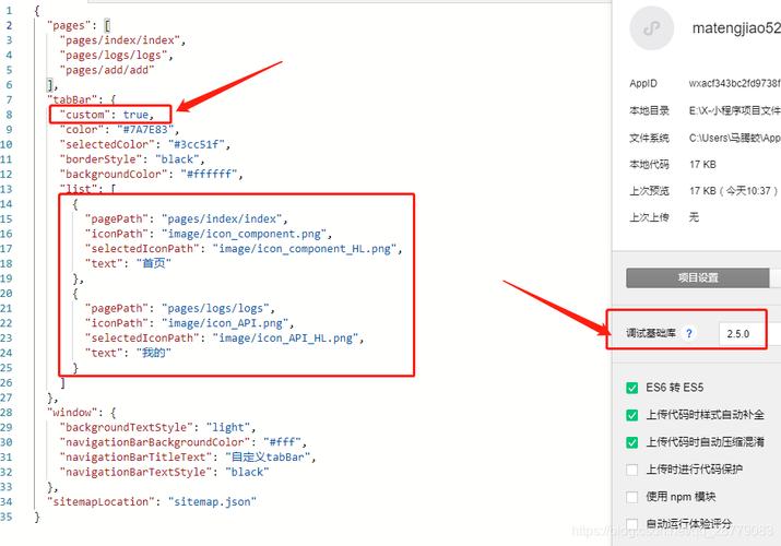
"tabBar": {

		"color": "#7A7E83",
		"selectedColor": "#086d5b",
		"backgroundColor": "#ffffff",
		"list": [
			{
				"pagePath": "pages/xxx/xxx"
			},
			{
				"pagePath": "pages/xxx/xxx"
			},
			{
				"pagePath": "pages/xxx/xxx"
			}
		]

	},
二、创建一个tabBar.vue组件
在uniapp项目的components目录下创建一个名为tabbar的组件,该组件包含了tabbar的整体布局和动态切换效果。
tabbar.vue组件HTML部分代码如下:
					{{item.text}}
					{{item.text}}


				{{item.text}}
				{{item.text}}
tabbar.vue组件JS部分代码如下:
    export default {

        name:"tabbar",
		props: ['current'],
        data() {
			return {
                list:  [
				          {
				          	pagePath: "页面路径",
				          	iconPath: "图标路径",
				          	selectedIconPath: "选中的图标路径",
				          	text: "文字"
				          },
				          {
				          	pagePath: "页面路径",
				          	iconPath: "图标路径",
				          	selectedIconPath: "选中的图标路径",
				          	text: "文字"
				          },
				          {
				          	pagePath: "页面路径",
				          	iconPath: "图标路径",
				          	selectedIconPath: "选中的图标路径",
				          	text: "文字"
				          }
				        ]
            }
        },
        created() {
		      uni.hideTabBar()
		    },

		 methods: {
		      changeTab(e) {
		        uni.switchTab({
		          url: '/' + this.list[e].pagePath,
		        })
		      }
		    }
}
tabbar.vue组件CSS部分代码如下:
 .tabbar {
	font-size: 1.5vh;
    position: fixed;
    left: 0;
    bottom: 0;
    z-index: 99;
    width: 100%;
    height: 6vh;
    display: flex;
    align-items: center;
    justify-content: space-around;
	background-color: #fff;
    padding: 20rpx 0;
  },
  .tabbar-item {
	height: 100%;
    padding: 0 40rpx;
	display: flex;
	align-items: center;
	justify-content: center;
  }
  .img {
    height: 3vh;
    width: 2.5vh;
	margin: 0 4vw;
  }
  .text {
	text-align: center;
    color: #CACACA;
  }
  .i-t{
	  font-size: 1.5vh;
	  padding:2vw 2vh;
	  position: absolute;
	  bottom: 1vh;
  }
  .select{
	width: 10vh;
	height:10vh;
	border-radius: 10vh;
	background-color: #086d5b;
	margin-bottom: 4vh;
	position: relative;
  }
  .imgactive{
	 height: 3.5vh;
	 width: 3.2vh;
	 margin: 0 2.2vw;
  }
  .text.active {
    color: #fff;
  }
css部分样式可以根据项目需要自行修改
三、在需要显示tabbar的页面中引入tabbar组件
	import tabbar from '@/components/tabbar/tabbar.vue'
	export default {
		components:{
		  tabbar
		}
	}
以上就是uniapp小程序自定义底部tabbar样式的方法的详细内容啦·~