
官方说明:A Material Design alert dialog.
翻译:一个材料设计警告对话框。
作者释义:显示弹窗,类似于element ui中的Dialog组件。
AlertDialog的定义
  const AlertDialog({
    super.key,
    this.icon,
    this.iconPadding,
    this.iconColor,
    this.title,
    this.titlePadding,
    this.titleTextStyle,
    this.content,
    this.contentPadding,
    this.contentTextStyle,
    this.actions,
    this.actionsPadding,
    this.actionsAlignment,
    this.actionsOverflowAlignment,
    this.actionsOverflowDirection,
    this.actionsOverflowButtonSpacing,
    this.buttonPadding,
    this.backgroundColor,
    this.elevation,
    this.shadowColor,
    this.surfaceTintColor,
    this.semanticLabel,
    this.insetPadding = _defaultInsetPadding,
    this.clipBehavior = Clip.none,
    this.shape,
    this.alignment,
    this.scrollable = false,
  });
属性:
| 属性名 | 属性值 |
|---|---|
| icon | 显示在对话框顶部的可选图标 |
| iconPadding | icon图标内边距 |
| iconColor | icon图标的颜色 |
| titlePadding | 标题内边距 |
| titleTextStyle | 标题样式 |
| content | Dialog内容 |
| contentPadding | 内容内边距 |
| contentTextStyle | 内容样式 |
| actions | 控件底部显示的操作集按钮 |
| actionsPadding | 操作集内边距 |
| actionsAlignment | 操作集对齐方式 |
| actionsOverflowAlignment | 操作集溢出对齐方式 |
| actionsOverflowDirection | 操作机溢出装饰 |
| actionsOverflowButtonSpacing | 操作集按钮间距 |
| buttonPadding | 按钮内边距 |
| backgroundColor | Diolog背景色 |
| elevation | 设置阴影的大小,若没设置shadowColor则无效 |
| shadowColor | 设置阴影颜色 |
| surfaceTintColor | 作对话框背景色上的表面色调叠加的颜色, 它反映了对话框的 elevation高程 |
| clipBehavior | 超出部分剪切方式 |
| insetPadding | 对话框距离屏幕边缘间距 |
| shape | 对话框外形 |
| alignment | 子控件对齐方式 |
| scrollable | 是否可以滚动 |
实例:
class AlertDialogWidget extends StatelessWidget {
const AlertDialogWidget({super.key});
@override
Widget build(BuildContext context) {
return ElevatedButton(
onPressed: null,
style: ButtonStyle(backgroundColor: MaterialStateProperty.all(Colors.indigo)),
child: SizedBox(
child: TextButton(
onPressed: () {
showDialog(context: context, builder: (context) {
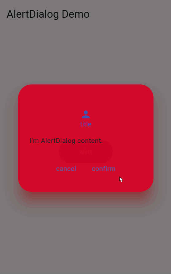
return AlertDialog(
icon: const Icon(Icons.person), // 图标
iconPadding: const EdgeInsets.only(top: 50), // 图标的内边距
iconColor: Colors.indigo, // 图标颜色
title: const Text("title"), // Dialog标题
titleTextStyle: const TextStyle(color: Colors.indigo), // 标题样式
content: const Text("I'm AlertDialog content."), // Dialog内容
actions: [ // Dialog事件
TextButton(
onPressed: () => Navigator.pop(context, 'Cancel'),
child: const Text("cancel"),
),
TextButton(
onPressed: () => Navigator.pop(context, 'Confirm'),
child: const Text("confirm"),
),
],
actionsAlignment: MainAxisAlignment.center,
backgroundColor: const Color(0xFFFF0000),
elevation: 24, // 控制阴影的大,若没设置shadowColor则无效
shadowColor: const Color(0xFFFF0000), // 设置阴影颜色
surfaceTintColor: const Color(0xFF0000FF), // surfaceTintColor
);
}
);
},
child: const Text(
"alert",
style: TextStyle(
fontSize: 12,
color: Colors.white,
),
),
),
));
}
}
注意
需要搭配showDialog方法使用