
注意:今天的教程比较长,请规划好你的时间。本文是付费内容,在本文文末有本教程的全部的代码和示例数据。
输出结果
分析代码
关于WGCNA分析,如果你的数据量较大,建议使用服务期直接分析,本地分析可能导致R崩掉。
设置文件位置
setwd("~/00_WGCNA/20230217_WGCNA/WGCNA_01")
加载分析所需的安装包
install.packages("WGCNA")
#BiocManager::install('WGCNA')
library(WGCNA)
options(stringsAsFactors = FALSE)
注意,如果你想打开多线程分析,可以使用一下代码
enableWGCNAThreads()

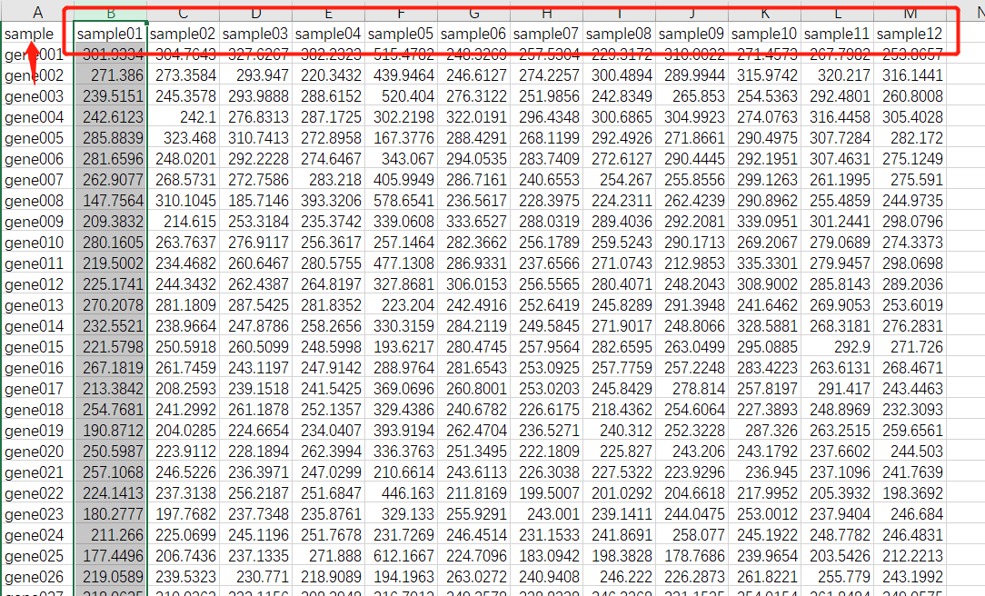
一、导入基因表达量数据
## 读取txt文件格式数据
WGCNA.fpkm = read.table("ExpData_WGCNA.txt",header=T,
                        comment.char = "",
                        check.names=F)
###############
# 读取csv文件格式
WGCNA.fpkm = read.csv("ExpData_WGCNA.csv", header = T, check.names = F)
数据处理
dim(WGCNA.fpkm)
names(WGCNA.fpkm)
datExpr0 = as.data.frame(t(WGCNA.fpkm[,-1]))
names(datExpr0) = WGCNA.fpkm$sample;##########如果第一行不是ID命名,就写成fpkm[,1]
rownames(datExpr0) = names(WGCNA.fpkm[,-1])
过滤数据
gsg = goodSamplesGenes(datExpr0, verbose = 3)
gsg$allOK
if (!gsg$allOK)
{
  if (sum(!gsg$goodGenes)>0)
    printFlush(paste("Removing genes:", paste(names(datExpr0)[!gsg$goodGenes], collapse = ", ")))
  if (sum(!gsg$goodSamples)>0)
    printFlush(paste("Removing samples:", paste(rownames(datExpr0)[!gsg$goodSamples], collapse = ", ")))
  # Remove the offending genes and samples from the data:
  datExpr0 = datExpr0[gsg$goodSamples, gsg$goodGenes]
}
过滤低于设定的值的基因
##filter
meanFPKM=0.5  ###--过滤标准,可以修改
n=nrow(datExpr0)
datExpr0[n+1,]=apply(datExpr0[c(1:nrow(datExpr0)),],2,mean)
datExpr0=datExpr0[1:n,datExpr0[n+1,] > meanFPKM]
# for meanFpkm in row n+1 and it must be above what you set--select meanFpkm>opt$meanFpkm(by rp)
filtered_fpkm=t(datExpr0)
filtered_fpkm=data.frame(rownames(filtered_fpkm),filtered_fpkm)
names(filtered_fpkm)[1]="sample"
head(filtered_fpkm)
write.table(filtered_fpkm, file="mRNA.filter.txt",
            row.names=F, col.names=T,quote=FALSE,sep="\t")
Sample cluster
sampleTree = hclust(dist(datExpr0), method = "average")
pdf(file = "1.sampleClustering.pdf", width = 15, height = 8)
par(cex = 0.6)
par(mar = c(0,6,6,0))
plot(sampleTree, main = "Sample clustering to detect outliers", sub="", xlab="", cex.lab = 2,
     cex.axis = 1.5, cex.main = 2)
### Plot a line to show the cut
#abline(h = 180, col = "red")##剪切高度不确定,故无红线
dev.off()
不过滤数据
如果你的数据不进行过滤直接进行一下操作,此步与前面的操作相同,任选异种即可。
## 不过滤
## Determine cluster under the line
clust = cutreeStatic(sampleTree, cutHeight = 50000, minSize = 10)
table(clust)
# clust 1 contains the samples we want to keep.
keepSamples = (clust!=0)
datExpr0 = datExpr0[keepSamples, ]
write.table(datExpr0, file="mRNA.symbol.uniq.filter.sample.txt",
            row.names=T, col.names=T,quote=FALSE,sep="\t")
###
#############Sample cluster###########
sampleTree = hclust(dist(datExpr0), method = "average")
pdf(file = "1.sampleClustering.filter.pdf", width = 12, height = 9)
par(cex = 0.6)
par(mar = c(0,4,2,0))
plot(sampleTree, main = "Sample clustering to detect outliers", sub="", xlab="", cex.lab = 1.5,
     cex.axis = 1.5, cex.main = 2)
### Plot a line to show the cut
#abline(h = 50000, col = "red")##剪切高度不确定,故无红线
dev.off()
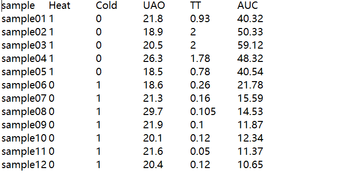
二、导入性状数据
traitData = read.table("TraitData.txt",row.names=1,header=T,comment.char = "",check.names=F)
allTraits = traitData
dim(allTraits)
names(allTraits)
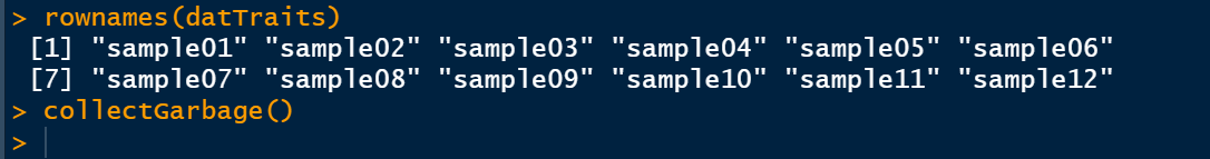
## 形成一个类似于表达数据的数据框架
fpkmSamples = rownames(datExpr0)
traitSamples =rownames(allTraits)
traitRows = match(fpkmSamples, traitSamples)
datTraits = allTraits[traitRows,]
rownames(datTraits)
collectGarbage()
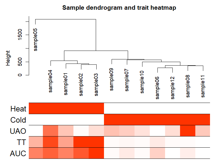
再次样本聚类
sampleTree2 = hclust(dist(datExpr0), method = "average")
# Convert traits to a color representation: white means low, red means high, grey means missing entry
traitColors = numbers2colors(datTraits, signed = FALSE)
输出样本聚类图
pdf(file="2.Sample_dendrogram_and_trait_heatmap.pdf",width=20,height=12)
plotDendroAndColors(sampleTree2, traitColors,
                    groupLabels = names(datTraits),
                    main = "Sample dendrogram and trait heatmap",cex.colorLabels = 1.5, cex.dendroLabels = 1, cex.rowText = 2)
dev.off()
三、WGCNA分析(后面都是重点)
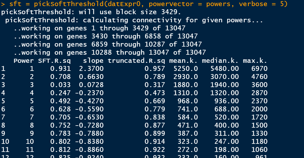
筛选软阈值
enableWGCNAThreads()
# 设置soft-thresholding powers的数量
powers = c(1:30)
sft = pickSoftThreshold(datExpr0, powerVector = powers, verbose = 5)
此步骤是比较耗费时间的,静静等待即可。
绘制soft Threshold plot
plot(sft$fitIndices[,1], -sign(sft$fitIndices[,3])*sft$fitIndices[,2],
     xlab="Soft Threshold (power)",ylab="Scale Free Topology Model Fit,signed R^2",type="n",
     main = paste("Scale independence"));
text(sft$fitIndices[,1], -sign(sft$fitIndices[,3])*sft$fitIndices[,2],
     labels=powers,cex=cex1,col="red");
# this line corresponds to using an R^2 cut-off of h
abline(h=0.8,col="red")
# Mean connectivity as a function of the soft-thresholding power
plot(sft$fitIndices[,1], sft$fitIndices[,5],
     xlab="Soft Threshold (power)",ylab="Mean Connectivity", type="n",
     main = paste("Mean connectivity"))
text(sft$fitIndices[,1], sft$fitIndices[,5], labels=powers, cex=cex1,col="red")
dev.off()

选择softpower
选择softpower是一个玄学的过程,可以直接使用软件自己认为是最好的softpower值,但是不一定你要获得最好结果;其次,我们自己选择自己认为比较好的softpower值,但是,需要自己不断的筛选。因此,从这里开始WGCNA的分析结果就开始受到不同的影响。
## 选择软件认为是最好的softpower值
#softPower =sft$powerEstimate
---
# 自己设定softpower值
softPower = 9
继续分析
adjacency = adjacency(datExpr0, power = softPower)
将邻接转化为拓扑重叠
这一步建议去服务器上跑,后面的步骤就在服务器上跑吧,数据量太大;如果你的数据量较小,本地也就可以
TOM = TOMsimilarity(adjacency);
dissTOM = 1-TOM
geneTree = hclust(as.dist(dissTOM), method = "average");
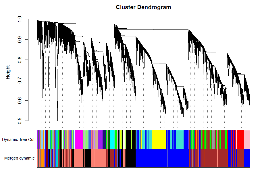
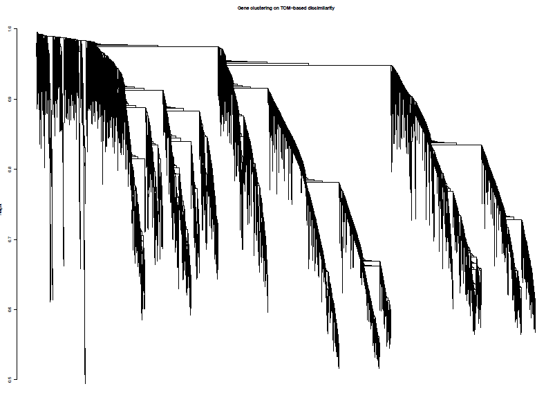
绘制聚类树(树状图)
pdf(file="4_Gene clustering on TOM-based dissimilarity.pdf",width=24,height=18)
plot(geneTree, xlab="", sub="", main = "Gene clustering on TOM-based dissimilarity",
     labels = FALSE, hang = 0.04)
dev.off()
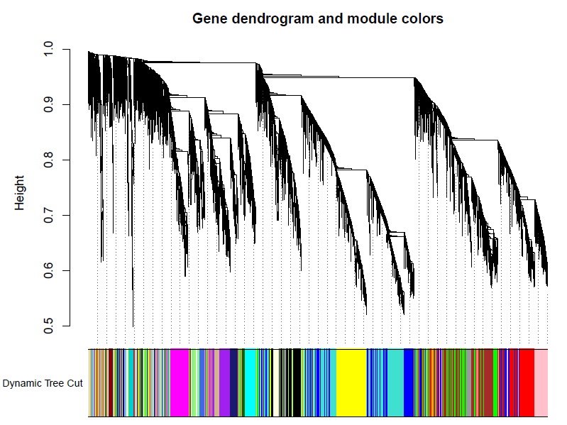
加入模块
minModuleSize = 30
# Module identification using dynamic tree cut:
dynamicMods = cutreeDynamic(dendro = geneTree, distM = dissTOM,
                            deepSplit = 2, pamRespectsDendro = FALSE,
                            minClusterSize = minModuleSize);
table(dynamicMods)
# Convert numeric lables into colors
dynamicColors = labels2colors(dynamicMods)
table(dynamicColors)
# Plot the dendrogram and colors underneath
#sizeGrWindow(8,6)
pdf(file="5_Dynamic Tree Cut.pdf",width=8,height=6)
plotDendroAndColors(geneTree, dynamicColors, "Dynamic Tree Cut",
                    dendroLabels = FALSE, hang = 0.03,
                    addGuide = TRUE, guideHang = 0.05,
                    main = "Gene dendrogram and module colors")
dev.off()
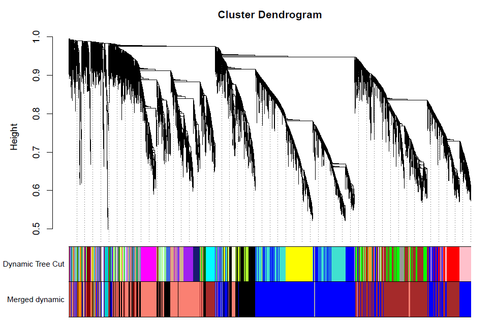
合并模块
做出的WGCNA分析中,具有较多的模块,但是在我们后续的分析中,是使用不到这么多的模块,以及模块越多对我们的分析越困难,那么就必须合并模块信息。具体操作如下。
MEList = moduleEigengenes(datExpr0, colors = dynamicColors)
MEs = MEList$eigengenes
# Calculate dissimilarity of module eigengenes
MEDiss = 1-cor(MEs);
# Cluster module eigengenes
METree = hclust(as.dist(MEDiss), method = "average")
# Plot the result
#sizeGrWindow(7, 6)
pdf(file="6_Clustering of module eigengenes.pdf",width=7,height=6)
plot(METree, main = "Clustering of module eigengenes",
     xlab = "", sub = "")
######剪切高度可修改
MEDissThres = 0.4
# Plot the cut line into the dendrogram
abline(h=MEDissThres, col = "red")
dev.off()

合并及绘图
 = mergeCloseModules(datExpr0, dynamicColors, cutHeight = MEDissThres, verbose = 3)
# The merged module colors
mergedColors = merge$colors
# Eigengenes of the new merged modules:
mergedMEs = merge$newMEs
table(mergedColors)
#sizeGrWindow(12, 9)
pdf(file="7_merged dynamic.pdf", width = 9, height = 6)
plotDendroAndColors(geneTree, cbind(dynamicColors, mergedColors),
                    c("Dynamic Tree Cut", "Merged dynamic"),
                    dendroLabels = FALSE, hang = 0.03,
                    addGuide = TRUE, guideHang = 0.05)
dev.off()
Rename to moduleColors
moduleColors = mergedColors
# Construct numerical labels corresponding to the colors
colorOrder = c("grey", standardColors(50))
moduleLabels = match(moduleColors, colorOrder)-1
MEs = mergedMEs
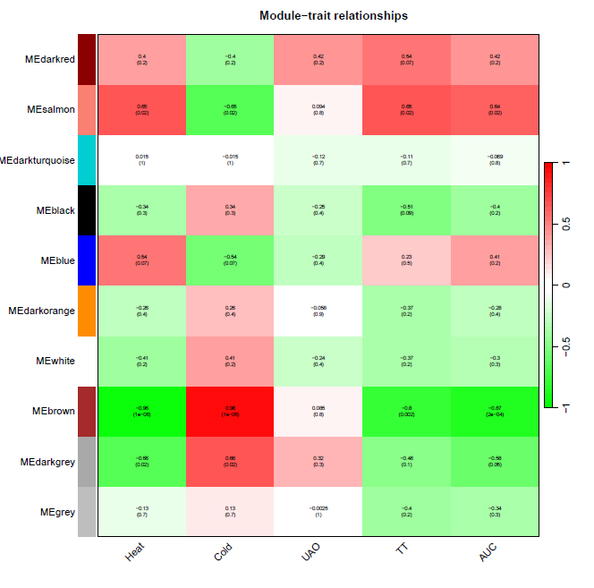
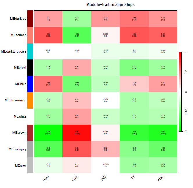
性状数据与基因模块进行分析
nGenes = ncol(datExpr0)
nSamples = nrow(datExpr0)
moduleTraitCor = cor(MEs, datTraits, use = "p")
moduleTraitPvalue = corPvalueStudent(moduleTraitCor, nSamples)
绘制模块性状相关性图
pdf(file="8_Module-trait relationships.pdf",width=10,height=10)
# Will display correlations and their p-values
textMatrix = paste(signif(moduleTraitCor, 2), "\n(",
                   signif(moduleTraitPvalue, 1), ")", sep = "")
dim(textMatrix) = dim(moduleTraitCor)
par(mar = c(6, 8.5, 3, 3))
# Display the correlation values within a heatmap plot
labeledHeatmap(Matrix = moduleTraitCor,
               xLabels = names(datTraits),
               yLabels = names(MEs),
               ySymbols = names(MEs),
               colorLabels = FALSE,
               colors = greenWhiteRed(50),
               textMatrix = textMatrix,
               setStdMargins = FALSE,
               cex.text = 0.5,
               zlim = c(-1,1),
               main = paste("Module-trait relationships"))
dev.off()
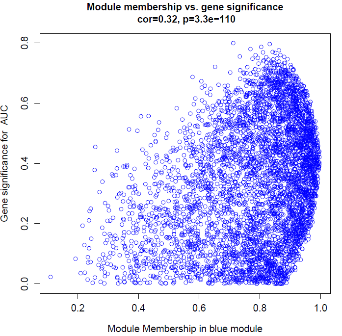
计算MM和GS
modNames = substring(names(MEs), 3)
geneModuleMembership = as.data.frame(cor(datExpr0, MEs, use = "p"))
MMPvalue = as.data.frame(corPvalueStudent(as.matrix(geneModuleMembership), nSamples))
names(geneModuleMembership) = paste("MM", modNames, sep="")
names(MMPvalue) = paste("p.MM", modNames, sep="")
#names of those trait
traitNames=names(datTraits)
geneTraitSignificance = as.data.frame(cor(datExpr0, datTraits, use = "p"))
GSPvalue = as.data.frame(corPvalueStudent(as.matrix(geneTraitSignificance), nSamples))
names(geneTraitSignificance) = paste("GS.", traitNames, sep="")
names(GSPvalue) = paste("p.GS.", traitNames, sep="")
批量绘制性状与各个模块基因的相关性图
for (trait in traitNames){
  traitColumn=match(trait,traitNames)
  for (module in modNames){
    column = match(module, modNames)
    moduleGenes = moduleColors==module
    if (nrow(geneModuleMembership[moduleGenes,]) > 1){####进行这部分计算必须每个模块内基因数量大于2,由于前面设置了最小数量是30,这里可以不做这个判断,但是grey有可能会出现1个gene,它会导致代码运行的时候中断,故设置这一步
      #sizeGrWindow(7, 7)
      pdf(file=paste("9_", trait, "_", module,"_Module membership vs gene significance.pdf",sep=""),width=7,height=7)
      par(mfrow = c(1,1))
      verboseScatterplot(abs(geneModuleMembership[moduleGenes, column]),
                         abs(geneTraitSignificance[moduleGenes, traitColumn]),
                         xlab = paste("Module Membership in", module, "module"),
                         ylab = paste("Gene significance for ",trait),
                         main = paste("Module membership vs. gene significance\n"),
                         cex.main = 1.2, cex.lab = 1.2, cex.axis = 1.2, col = module)
      dev.off()
    }
  }
}
names(datExpr0)
probes = names(datExpr0)
输出GS和MM数据
geneInfo0 = data.frame(probes= probes,
                       moduleColor = moduleColors)
for (Tra in 1:ncol(geneTraitSignificance))
{
  oldNames = names(geneInfo0)
  geneInfo0 = data.frame(geneInfo0, geneTraitSignificance[,Tra],
                         GSPvalue[, Tra])
  names(geneInfo0) = c(oldNames,names(geneTraitSignificance)[Tra],
                       names(GSPvalue)[Tra])
}
for (mod in 1:ncol(geneModuleMembership))
{
  oldNames = names(geneInfo0)
  geneInfo0 = data.frame(geneInfo0, geneModuleMembership[,mod],
                         MMPvalue[, mod])
  names(geneInfo0) = c(oldNames,names(geneModuleMembership)[mod],
                       names(MMPvalue)[mod])
}
geneOrder =order(geneInfo0$moduleColor)
geneInfo = geneInfo0[geneOrder, ]
write.table(geneInfo, file = "10_GS_and_MM.xls",sep="\t",row.names=F)
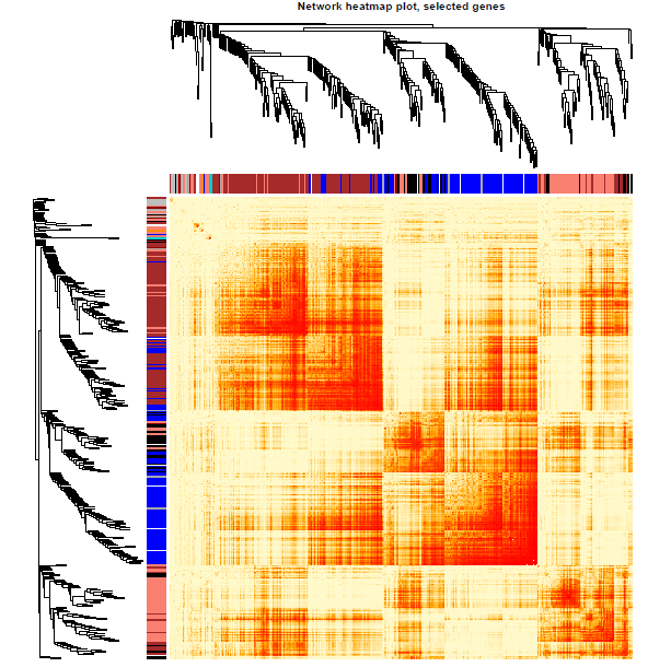
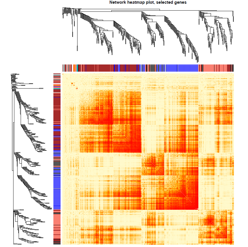
可视化基因网络
nGenes = ncol(datExpr0)
nSamples = nrow(datExpr0)
nSelect = 400
# For reproducibility, we set the random seed 不能用全部的基因,不然会爆炸的
set.seed(10)
select = sample(nGenes, size = nSelect)
selectTOM = dissTOM[select, select]
selectTree = hclust(as.dist(selectTOM), method = "average")
selectColors = moduleColors[select]
#sizeGrWindow(9,9)
# Taking the dissimilarity to a power, say 10, makes the plot more informative by effectively changing
# the color palette; setting the diagonal to NA also improves the clarity of the plot
plotDiss = selectTOM^7
diag(plotDiss) = NA
绘图
library("gplots")
pdf(file="13_Network heatmap plot_selected genes.pdf",width=9, height=9)
mycol = colorpanel(250,'red','orange','lemonchiffon')
TOMplot(plotDiss, selectTree, selectColors, col=mycol ,main = "Network heatmap plot, selected genes")
dev.off()
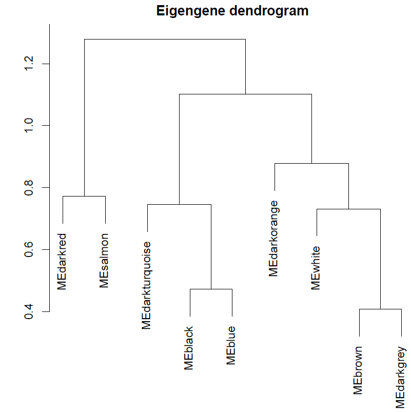
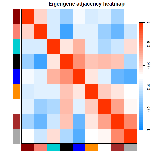
特征基因的基因网络可视化
pdf(file="14_Eigengene dendrogram and Eigengene adjacency heatmap.pdf", width=5, height=7.5)
par(cex = 0.9)
plotEigengeneNetworks(MEs, "", marDendro = c(0,4,1,2), marHeatmap = c(3,4,1,2), cex.lab = 0.8, xLabelsAngle= 90)
dev.off()
获得本教程代码链接:WGCNA分析 | 全流程分析代码 | 代码一
小杜的生信筆記 ,主要发表或收录生物信息学的教程,以及基于R的分析和可视化(包括数据分析,图形绘制等);分享感兴趣的文献和学习资料!!