最近在网上看到别人做的爬取微信聊天记录并分析聊天内容,GitHub上试着运行了一下,这好东西肯定要分享出来给各位,总结一下几年的微信聊天内容😁,废话不多说,下面一步步来。先展示一下,我和我对象的聊天内容分析:

源代码和出处:GitHub - LC044/WeChatMsg: 提取微信聊天记录,将其导出成HTML、Word、CSV文档永久保存,对聊天记录进行分析生成年度聊天报告
大家记得给作者点点star,督促作者开发更优的信息抓取功能。
一、微信聊天记录爬取
下载微信聊天记录爬取程序:(软件安全正常,直接无视安全问题😎)
https://github.com/LC044/WeChatMsg/releases/download/v1.0.6/MemoTrace-1.0.6.exe
电脑需要登录微信,如果电脑微信聊天记录不齐全,可以通过手机进行微信聊天记录迁移。
- 安卓: 手机微信->我->设置->聊天->聊天记录迁移与备份->迁移-> 迁移到电脑微信(迁移完成后重启微信)
- iOS: 手机微信->我->设置->通用->聊天记录迁移与备份->迁移-> 迁移到电脑微信(迁移完成后重启微信)
打开软件,随后点击获取信息,获取手机号、微信昵称、wxid等内容,之后点击开始启动就行。
若出现wxid或微信路径无法获取问题,查看解决办法("留痕"使用教程 (lc044.love)),一般都是没问题的。

选择 “数据 --> 批量导出”,选择你想要导出的联系人信息。导出格式选择csv格式,方便我们后续利用python进行数据分析:
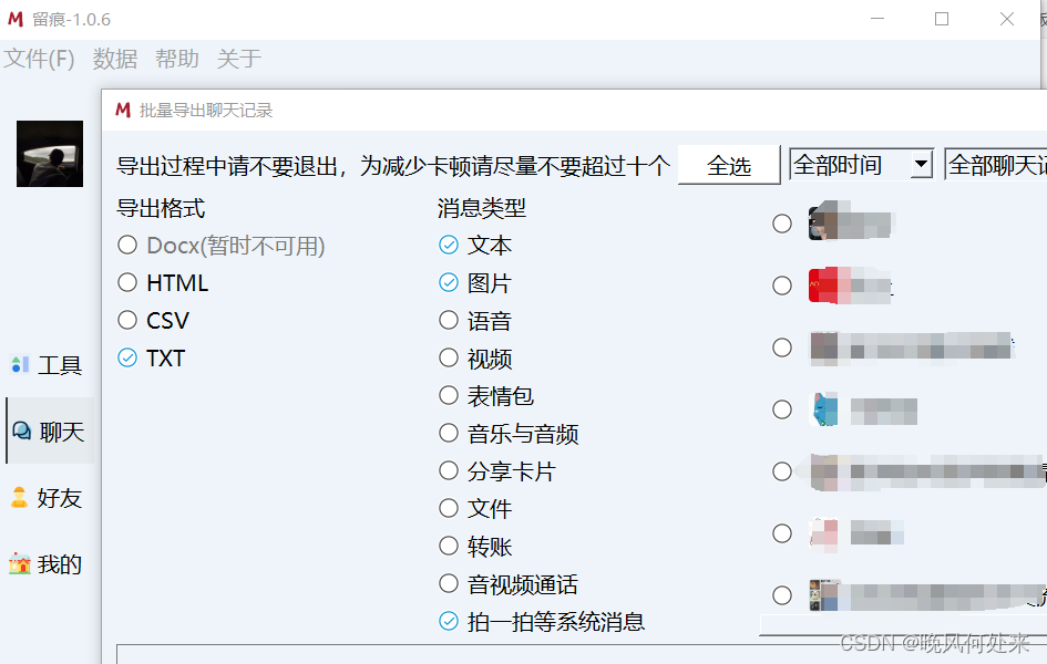
导出后的结果在程序同目录下的“data --> 聊天记录“文件中,我们需要csv文件,记住csv文件的地址,自此微信聊天记录爬取结束👌。
PS:上述软件也可以进行数据分析,作者也贴出年度报告,各位可以尝试一下,不过内容较少且存在乱码。
二、内容分析可视化展示:
环境配置:python3.8(3.10matplotlib不兼容问题) numpy pandas seaborn jieba july wordcloud
接下来直接内容分析代码,代码中需要根据你的CSV文件地址修改以及聊天双方名字修改:
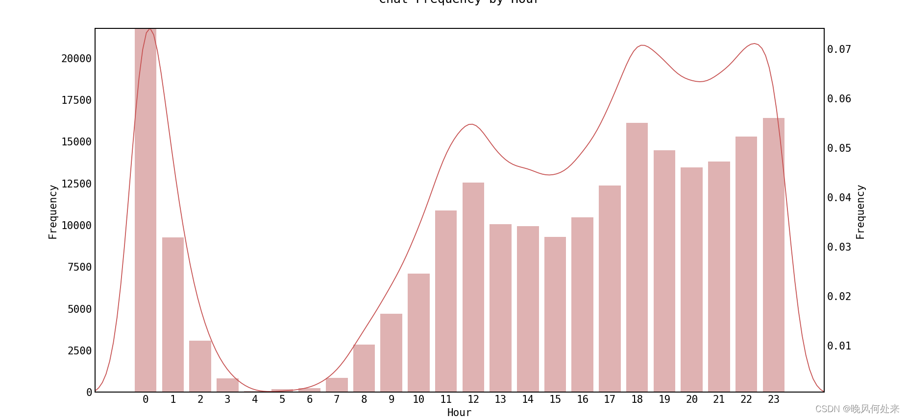
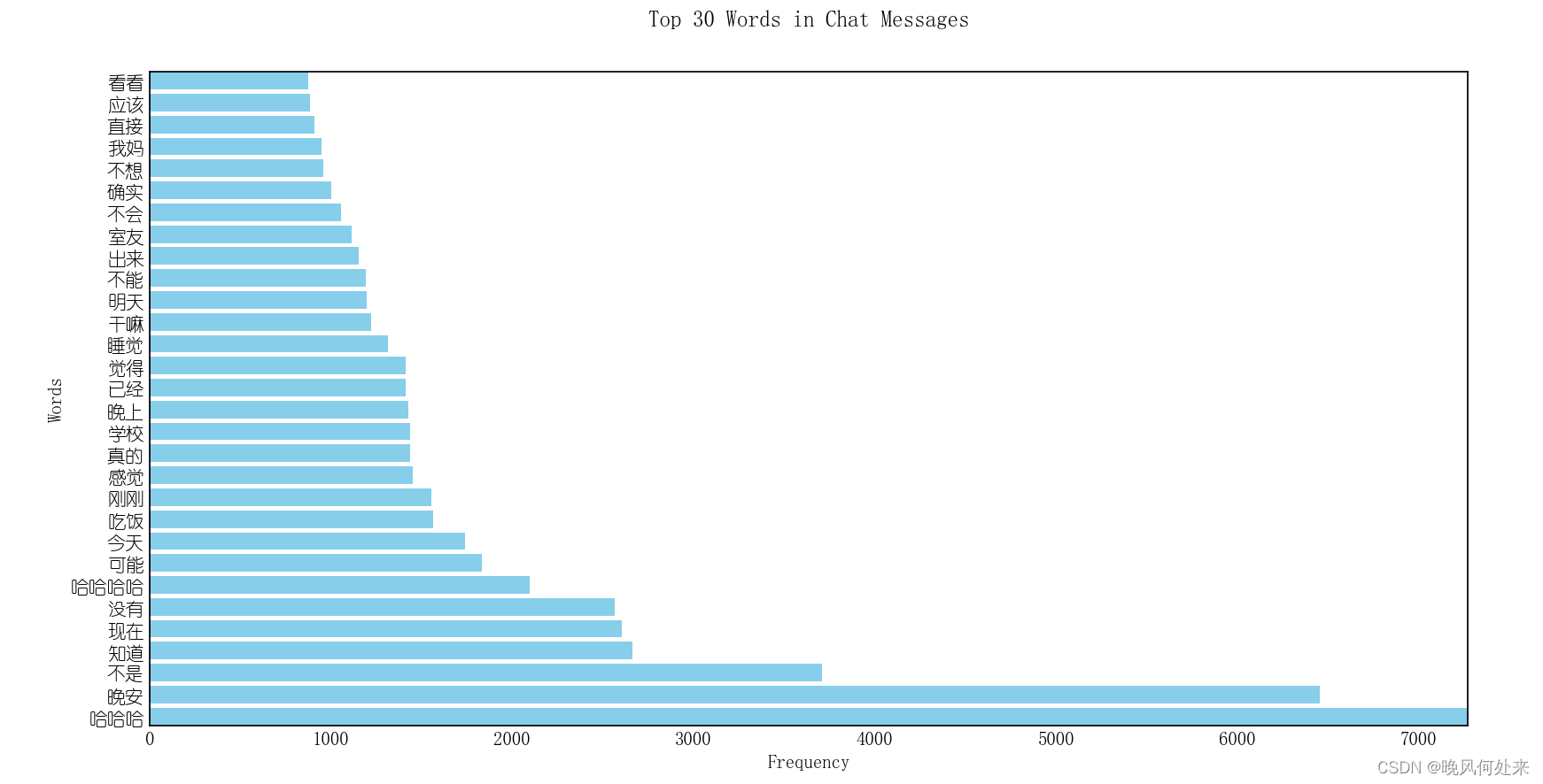
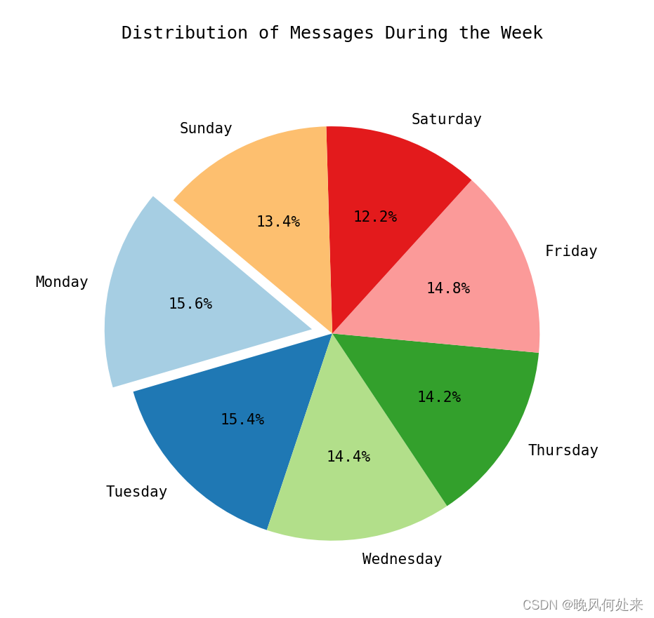
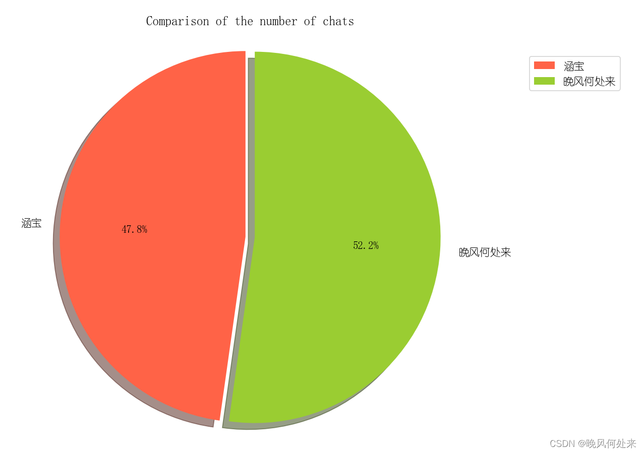
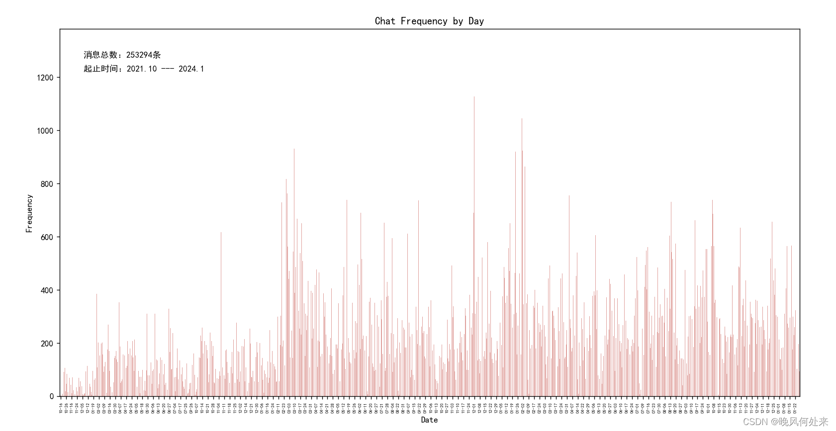
import matplotlib.pyplot as plt import pandas as pd import re import july import jieba from july.utils import date_range import seaborn as sns from scipy.stats import norm import numpy as np from wordcloud import WordCloud from collections import Counter def set_chinese_font(): # 设置中文字体 plt.rcParams['font.sans-serif'] = ['SimHei'] # 设置中文字体为黑体 plt.rcParams['axes.Unicode_minus'] = False # 用来正常显示负号 def read_chat_data(file_path): # 读取CSV文件 df = pd.read_csv(file_path) return df def preprocess_data(df): # 数据预处理 df = df[df['Type'] == 1] # 只保留文本聊天 selected_columns = ['IsSender', 'StrContent', 'StrTime'] df = df[selected_columns] # 只取'IsSender','StrContent','StrTime'列 df['StrTime'] = pd.to_datetime(df['StrTime']) df['Date'] = df['StrTime'].dt.date return df def plot_chat_frequency_by_day(df): # 每天聊天频率柱状图 chat_frequency = df['Date'].value_counts().sort_index() chat_frequency.plot(kind='bar', color='#DF9F9B') total_messages = len(df) date_labels = [date.strftime('%m-%d') for date in chat_frequency.index] plt.text(30, 1300, '消息总数:{0}条'.format(total_messages), ha='left', va='top', fontsize=10, color='black') plt.text(30, 1250, '起止时间:{0} --- {1}'.format(date_labels[0], date_labels[-1]), ha='left', va='top', fontsize=10, color='black') plt.xlabel('Date') plt.ylabel('Frequency') plt.title('Chat Frequency by Day') plt.xticks(range(1, len(date_labels), 7), date_labels[::7]) plt.xticks(fontsize=5) plt.show() def plot_calendar_heatmap(df): # 制作日历热力图 df['Date'] = pd.to_datetime(df['Date']) start_date = df['Date'].min() end_date = df['Date'].max() dates = date_range(start_date, end_date) july.heatmap(dates=dates, data=df['Date'].value_counts().sort_index(), cmap='Pastel1', month_grid=True, horizontal=True, value_label=False, date_label=False, weekday_label=True, month_label=True, year_label=True, colorbar=False, fontfamily="monospace", fontsize=12, title=None, titlesize='large', dpi=100) plt.tight_layout() plt.show() def analyze_message_comparison(df): # 双方信息数量对比 sent_by_me = df[df['IsSender'] == 1]['StrContent'] sent_by_others = df[df['IsSender'] == 0]['StrContent'] count_sent_by_me = len(sent_by_me) count_sent_by_others = len(sent_by_others) labels = ['你的名字', '聊天对象的名字'] sizes = [count_sent_by_me, count_sent_by_others] colors = ['#FF6347', '#9ACD32'] explode = (0, 0.05) plt.rc('font', family='YouYuan') plt.pie(sizes, explode=explode, labels=labels, colors=colors, autopct='%1.1f%%', shadow=True, startangle=90) plt.axis('equal') plt.title('Comparison of the number of chats') plt.legend() plt.show() def analyze_hourly_chat_frequency(df): # 根据一天中的每一个小时进行统计聊天频率,并生成柱状图 df['DateTime'] = pd.to_datetime(df['StrTime']) df['Hour'] = df['DateTime'].dt.hour hourly_counts = df['Hour'].value_counts().sort_index().reset_index() hourly_counts.columns = ['Hour', 'Frequency'] plt.figure(figsize=(10, 8)) plt.rc('font', family='YouYuan') ax = sns.barplot(x='Hour', y='Frequency', data=hourly_counts, color="#E6AAAA") sns.kdeplot(df['Hour'], color='#C64F4F', linewidth=1, ax=ax.twinx()) plt.title('Chat Frequency by Hour') plt.xlabel('Hour of the Day') plt.ylabel('Frequency') plt.show() def is_chinese_word(word): for char in word: if not re.match(r'[\u4e00-\u9fff]', char): return False return True def correct(a, stop_words): b = [] for word in a: if len(word) > 1 and is_chinese_word(word) and word not in stop_words: b.append(word) return b def word_fre_draw(a, str): a_counts = Counter(a) top_30_a = a_counts.most_common(30) words, frequencies = zip(*top_30_a) # 绘制水平柱状图 plt.figure(figsize=(10, 15)) plt.barh(words, frequencies, color='skyblue') plt.xlabel('Frequency') plt.ylabel('Words') plt.title('Top 30 Words in Chat Messages for {0}'.format(str)) plt.show() def word_frequency_analysis(df): sent_by_me_text = ' '.join(df[df['IsSender'] == 1]['StrContent'].astype(str)) sent_by_others_text = ' '.join(df[df['IsSender'] == 0]['StrContent'].astype(str)) all_text = ' '.join(df['StrContent'].astype(str)) words = list(jieba.cut(all_text, cut_all=False)) my_words = list(jieba.cut(sent_by_me_text, cut_all=False)) others_words = list(jieba.cut(sent_by_others_text, cut_all=False)) with open('stopwords_hit.txt', encoding='utf-8') as f: # 添加屏蔽词汇 con = f.readlines() stop_words = set() # 集合可以去重 for i in con: i = i.replace("\n", "") # 去掉读取每一行数据的\n stop_words.add(i) Words = correct(words, stop_words) My_words = correct(my_words, stop_words) others_words = correct(others_words, stop_words) words_space_split = ' '.join(Words) word_fre_draw(Words, 'All') word_fre_draw(My_words, '你的名字') word_fre_draw(others_words, '他/她的名字') return words_space_split def word_cloud(words_space_split): wordcloud = WordCloud(font_path='C:\Windows\Fonts\STCAIYUN.TTF', width=800, height=600, background_color='white', max_words=200, max_font_size=100, ).generate(words_space_split) plt.figure(figsize=(10, 8)) plt.imshow(wordcloud, interpolation='bilinear') plt.axis('off') plt.show() def analyze_weekly_contribution(df): df['Weekday'] = df['StrTime'].dt.day_name() # 计算每天的消息数量 weekday_counts = df['Weekday'].value_counts().reindex([ "Monday", "Tuesday", "Wednesday", "Thursday", "Friday", "Saturday", "Sunday" ]) # 找出频率最高的那天 max_day = weekday_counts.idxmax() # 制作饼状图 plt.figure(figsize=(8, 8)) explode = [0.1 if day == max_day else 0 for day in weekday_counts.index] # 突出显示频率最高的那天 plt.pie(weekday_counts, labels=weekday_counts.index, explode=explode, autopct='%1.1f%%', startangle=140, colors=plt.cm.Paired.colors) plt.title('Distribution of Messages During the Week') plt.show() def analyze_most_active_day_and_month(df): df['Date'] = pd.to_datetime(df['Date']) df['YearMonth'] = df['Date'].dt.to_period('M') df['Day'] = df['Date'].dt.date daily_counts = df['Day'].value_counts() max_day = daily_counts.idxmax() max_day_count = daily_counts.max() monthly_counts = df['YearMonth'].value_counts() max_month = monthly_counts.idxmax() max_month_count = monthly_counts.max() print(f"Most active day: {max_day}, with {max_day_count} messages.") print(f"Most active month: {max_month}, with {max_month_count} messages.") if __name__ == "__main__": set_chinese_font() df = read_chat_data('CSV文件') # 加载数据集 df = preprocess_data(df) # 数据预处理 plot_chat_frequency_by_day(df) # 绘制每日聊天频率柱状图 plot_calendar_heatmap(df) # 绘制日历热力图 analyze_message_comparison(df) # 消息占比对比 analyze_hourly_chat_frequency(df) # 每小时聊天频率柱状图 words = word_frequency_analysis(df) # 词汇频率分析 word_cloud(words) # 词云制作 analyze_weekly_contribution(df) # 每周聊天频率 analyze_most_active_day_and_month(df) # 聊天最多的月和天文件中引用有停词文件,可以从GitHub上下载你想使用的(差不多都一样,可以在文件中添加新的屏蔽词语)。停词文件和代码文件放在同一目录下:
GitHub - goto456/stopwords: 中文常用停用词表(哈工大停用词表、百度停用词表等)
然后直接运行代码就可以等着一张一张的图片展示啦😀😀
各位有任何问题评论区欢迎提问😊